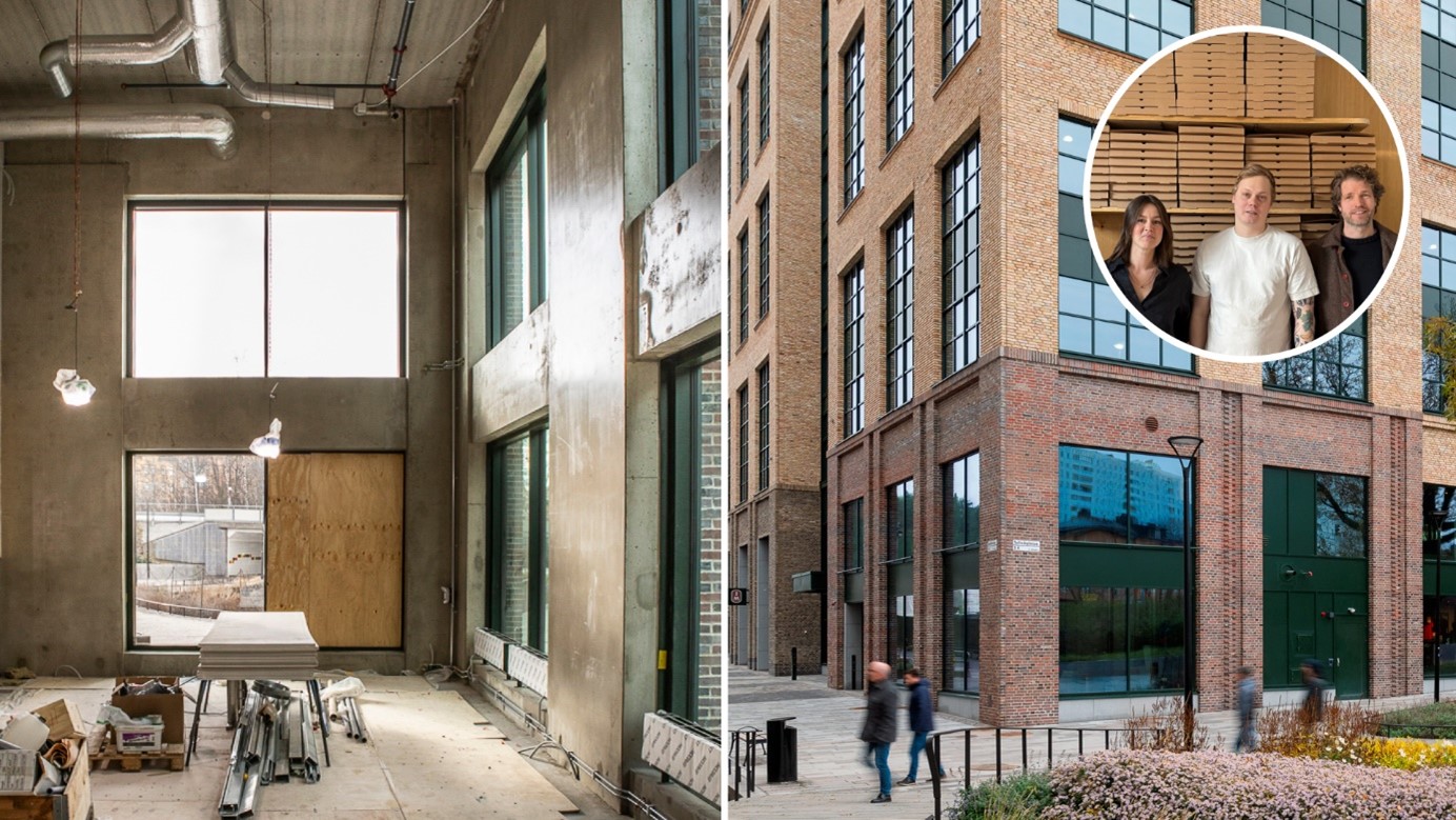
Reflective surface adds depth to facade
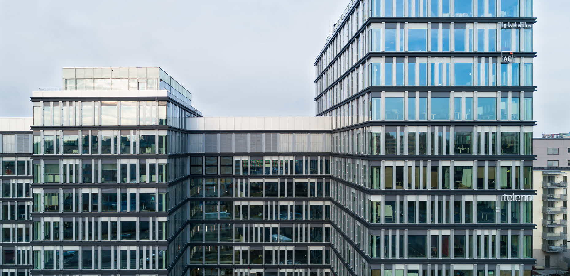
No1 Råsunda has quite a complex appearance and has several different levels – the highest section has 14 floors and the lower has 11. However, the building still feels cohesive owing to the strong horizontal lines and vertical windows that are a feature throughout the facade.
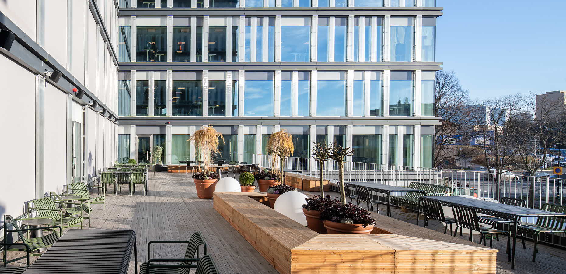
“We’ve used large windows right down to the floor. They have a lovely effect inside and give the building the feel of a glass atrium. There are also glass pilasters on the outside. When the glass catches the light, the facade gains depth and the building has a different character depending on the weather. The matt, dark grey beam structures form a contrast with the glass,” says Erik.
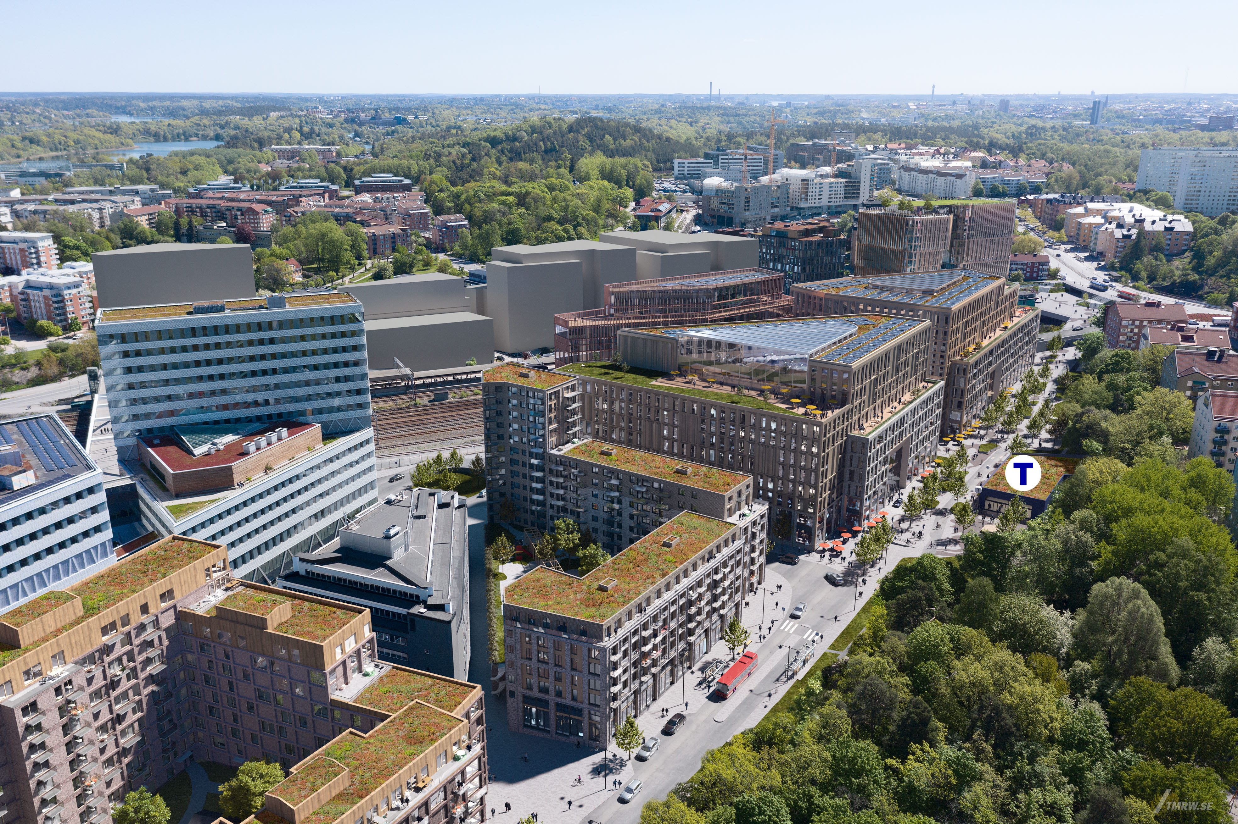
The highest part is at the intersection between Frösundaleden and Solnaleden, which is also the site of the main entrance. At the other end, at Garvis Carlssons gata, the design comes to a dramatic point. Working with the City of Solna, Fabege is creating a plaza-like area here which will function as a meeting point for underground and light rail passengers and office workers in the area.
“Services, restaurants and shops will be added to give the place an urban buzz,” explains Erik.
Telenor prizes flexibility
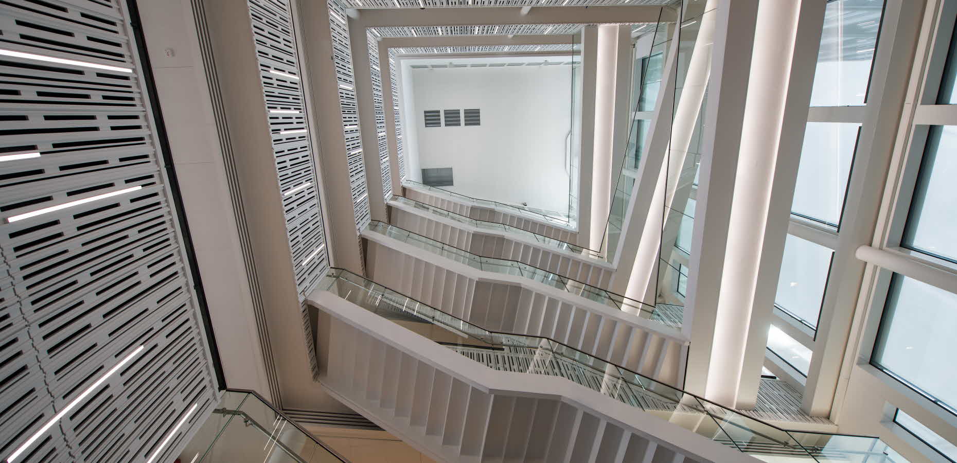
Telenor has been involved from the outset, and the architects have made adjustments to the floor plan according to the company’s wishes. For Telenor it’s important to have a flexible, open office space, which led to the decision to locate the stairwells towards the north facade instead of right in the middle of the building, as originally planned.
“The result is a stylish building that both suits Telenor and is representative of Solna,” says Erik.
No1 Råsunda is environmentally certified in accordance with BREEAM Very Good, which means that the building makes a clear contribution towards improving the environment. On the roof there will be solar panels and a sedum roof for vegetation. The architects were also mindful of energy calculations when designing the office.
“Fabege maintains a high environmental profile and is ambitious in this area, and it’s great to work in this way,” comments Erik.
Erik Hovlin on what’s trending in offices and architecture:
- Deep buildings for more space and greater flexibility. The challenge is to allow in plenty of natural light, something that can be achieved with high ceilings and an atrium.
- Activity-based, within reason. These days companies start by looking at the work that is to be done, and then decide how employees are to sit based on that.
- Wood frames as a quicker, lighter and more eco-friendly alternative to steel and concrete.
- Flexible construction – it should be possible to adapt the office over time, if, for example, you want to move workstations, put up walls, etc.

